Gnuplot
At first sight, Gnuplot may not seem-friendly, as when you open the software there is only an almost blank window. It depends on written commands to run, but once you understand the basic logic on how they work, they are pretty intuitive. Although there is an official manual available, reading it can be confusing for a beginner, and often few hours are necessary to be able to create a simple graph. Thus, aiming at a more time efficient learning process, we decided to write this manual, in English and also in Czech version, as it is difficult to find information in this last language. Our goal is not to provide a complete list of the software capabilities, but only to introduce the new user to it. Further information can always be obtained in the official manual, and online, but a certain level of expertise is required even to know what to look for. We hope this material will help students to acquire this basic knowledge and that they will be satisfied in using this software in their work.
Gnuplot is an open source software that can be downloaded from the official web page http://www.gnuplot.info/
1. General information
Gnuplot software uses a series of commands that define the plotting parameters to create a graph from one or more datafiles (that contain the information to be plotted). For generating a simple plot in gnuplot, the commands can be written directly to the Gnuplot window. However, the use of a script makes it possible to edit the plotting settings and to open the graph just by double-clicking a file. A script is a sequence of commands run by Gnuplot software using the files containing the data to be plotted. A text editor (notepad, notepad++, etc) can be used to write a script, that needs to be saved with .plt file extension and in the same folder containing the data files.
In the next paragraphs, we will present the basic steps to create a plotting script.
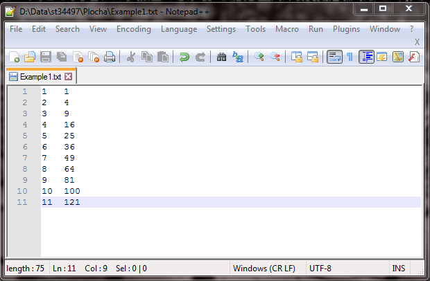
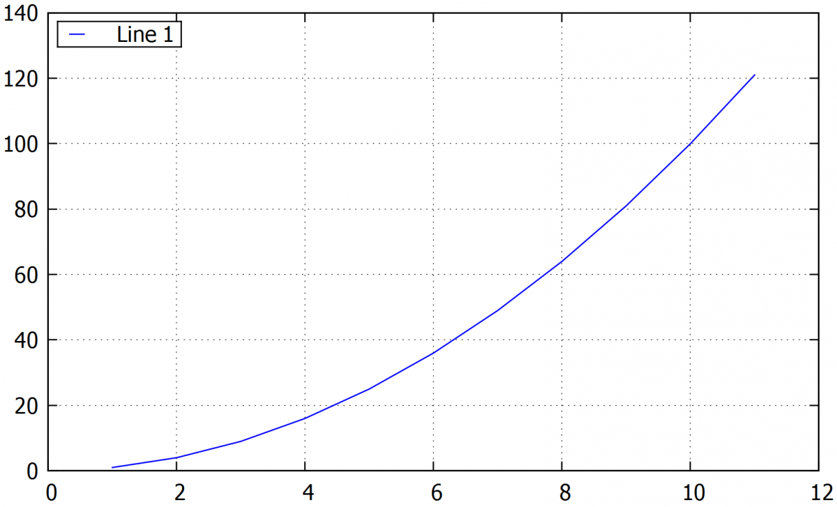
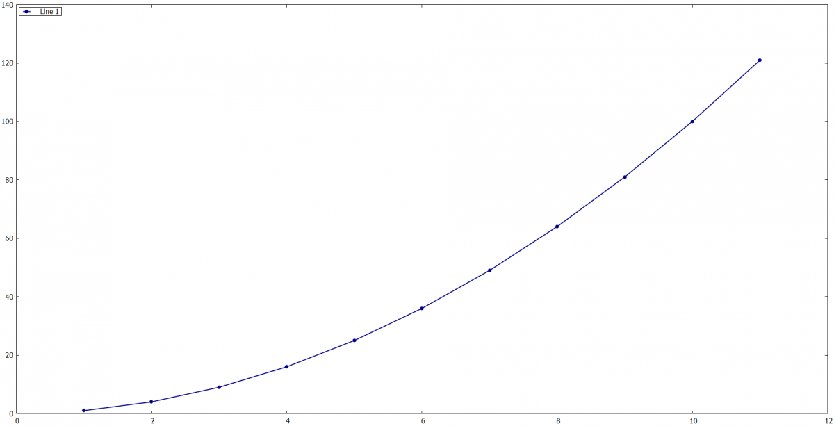
For this first example, we will use the datafile called “Example 1.txt” shown below. It contains two columns separated by space, the first column represents time in ms and the second column distances in cm. This file is a .txt extension, but other types of data files (as .csv) are also supported, as long as they contain only numbers and are organized in columns.
In this example, we want to plot distance in the y axis (column 2) versus time in the x axis (column 1).
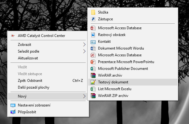
The first step is to create a new text file that will be our script, and where the commands will be written. To do so, we open the folder containing the datafile “Example 1.txt”, right click, choose "new" and then "new text document". We recommend using an advanced version of notepad, called notepad++, that can be downloaded from this link:
https://notepad-plus-plus.org/download/v7.5.3.html
The commands are then added to the created text file to set the plotting parameters (axis, font size, grid, legend etc). A basic plotting script is shown as follows:
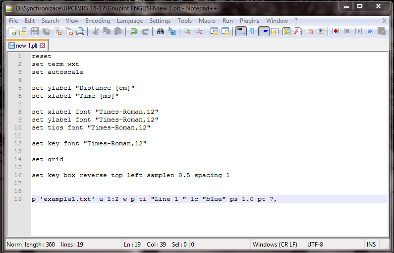
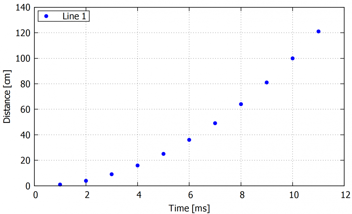
As seen, each command corresponds to a plot setting, for example, “set key font” sets the font style and size. The “p” command corresponds to the plotting itself, that calls the datafile to be plotted (in this case “example 1.txt”). This script leads to the following graph:
Tip: In notepad++ I recommend to use a wrap of the lines (view -> wrap) for the case of writing longer comments or working in a narrow window. For clarity in the script, a syntax for Gnuplot can be set up.
If wanted, explanatory notes can be added to the script by the writing a # symbol at the beginning of the line. This way anything in this line after the # symbol is read as text, and not considered as a command by the program. For clarity, we also recommend skipping a line between commands.
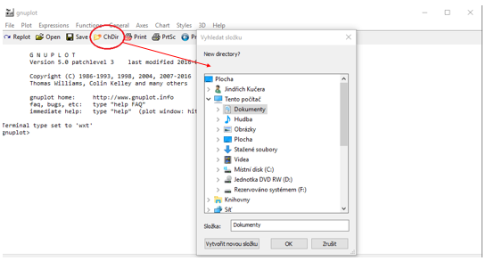
2. Opening the script
With the Gnuplot window opened, first, we need to change the directory to choose the folder containing both the script and the data file. For that, we click the icon ”ChDir” on the top of the panel as shown in the following picture.-->First, we need to change the directory to choose the folder containing both the script and the data file. For that, we click on the icon ”ChDir” on the top of the gnuplot window as shown in the following picture.
When the directory is changed, we can open our script by cliking on the ”open” icon again at the top of the panel. If we cannot find our script in the folder, it is necessary to check if it is saved with the .plt extension.
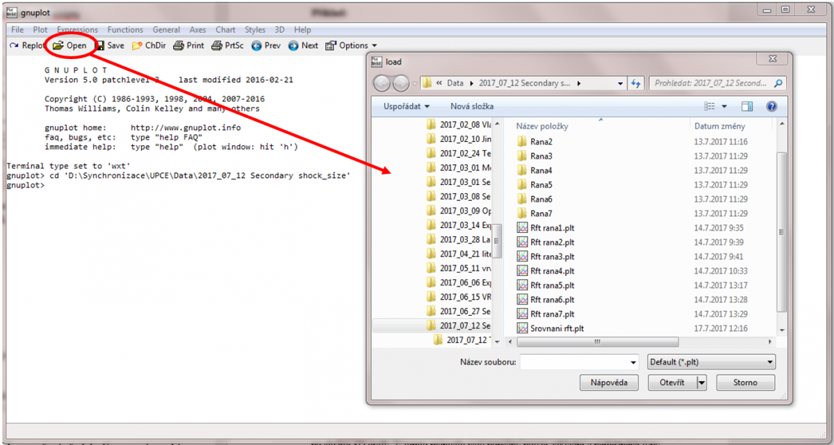
Scripts can be also opened directly from the folder by double-clicking the .plt file without having to open the Gnuplot window. This option is useful in the cases when we need just a quick view of the graph without changing the commands. However, for writing or editing a script it is advisable to use the software window, as the double-clicking generates a new window every time, while the Gnuplot window replaces the old graph by the modified one.
In the Gnuplot window, we can choose previously typed commands by pressing the up and down arrows in the keyboard, until the wanted command is shown, and then confirm our choice by pressing enter.
3. Creating a curve from a data file
The biggest advantage of Gnuplot is its simplicity. The data can be read directly from the data file and doesn’t need to be imported or copied to the software, as it happens with some basic software like MS Excel. This chapter describes how to plot curves from a data file. Every subsection presents a command, the possible plotting options. A complete example of a command with options will be shown at the end of the subsections.
3.1. Plotting a single curve
Plotting a curve from the data file called "XXX.txt". After the name of the data file, optional settings can be added, as described in the following topics of this subsection.The curve can be also plotted without a data file, using a function instead (etc. "plot sin(x)")
-
plot 'XXX.txt'
If the data file contains more than two columns, this optional command determines which columns are the x and y-axis:
- using 1:2
If we have a large data file, reading all points can significantly slow the plotting. To avoid that, we can use every n command, that allows for reading and plotting only 1 every n lines in the data file. If it is not defined, gnuplot will automatically read every line from the source file.
- every 10
The following command shows the title of the curve in the legend. If we don’t want that curve to have a title in the legend, we can use “” (empty quotation marks).
- title / ti "XXX"
Setting the range of lines in the data file to be plotted:
- every ::1000::2000
Following command plots the data file from the third line onwards:
- every ::3
Following command limits the range of the values to be plotted in the first column. In the example given only x-axis values lower than 1700 are plotted.
- u ($1<1700 ? $1 : 1/0):2
Advanced version of the previous command. Only a values between the defined numbers will be ploted and also 960 will be subtracted from original vlaues.
- u ($1>2700&&$1<3300 ? $1-960 : 1/0)
Another specific case of the filtering command, but applying to the second column (y-axis). Only y values bigger than 100 are plotted.
- using 1:($3>100 ? $2 : 1/0)
Use of the range limiting command with functions. Function f(x) will be plotted in the range of values 0.1< x <0.7.
- (x < 0.7 && x>0.1) ? f(x) : 1/0 ti "Function f(x) " with lines lc "dark-red"
Example:
plot "Shot1.csv" u 1:6 every 5 ti "CH5"
Full command for plotting data from Shot1.csv file, with column 1 in the x-axis and column 6 in the y-axis, using only one every 5 lines in the file. the columns 1 and 6. The curve will be called „CH5“ in the legend.
3.2. Plotting more than one curve
This is done in a similar way as for a single curve. After the command for the first curve, add a comma and then the names of the other data files. For clarity, we can divide the plotting command into multiple lines by adding \ (that works a separator) at the end of every line.
Example:
plot "Shot1.csv" u 1:2 every 5 ti "Shot 1 CH1" lc "blue" pt 7 ps 0.3, \
"Shot1.csv" u 1:3 every 5 ti " Shot 1 CH2" lc "dark-red" pt 7 ps 0.3, \
"Shot2.csv" u 1:2 every 5 ti " Shot 2 CH1" lc "dark-green" pt 7 ps 0.3, \
"Shot2.csv" u 1:3 every 5 ti " Shot 2 CH2" lc "black" pt 7 ps 0.3,
or
plot "Shot1.csv" u 1:2 every 5 ti "Shot 1 CH1" lc "blue" pt 7 ps 0.3, "Shot1.csv" u 1:3 every 5 ti " Shot 1 CH2" lc "dark-red" pt 7 ps 0.3, "Shot2.csv" u 1:2 every 5 ti " Shot 2 CH1" lc "dark-green" pt 7 ps 0.3, "Shot2.csv" u 1:3 every 5 ti " Shot 2 CH2" lc "black" pt 7 ps 0.3,
In this example four curves will be plotted from the data files called Shot1.csv and Shot2.csv. All curves have the same x axis and only 1 every 5 lines is used. The options “lc “blue” pt .7 and ps 0.3” are part of plotting settings, and will be described in the next chapter.
Tip: If we are plotting more than a single curve from the same data file, we can define the source file in the first line and add only “” (empty quotation marks) instead of the file name for the rest of the command, as shown in the following example.
Example:
plot "Shot1.csv" u 1:2 every 5 ti "Shot 1 CH1" lc "blue" pt 7 ps 0.3, \
"" u 1:3 every 5 ti " Shot 1 CH2" lc "dark-red" pt 7 ps 0.3, \
"Shot2.csv" u 1:2 every 5 ti " Shot 2 CH1" lc "dark-green" pt 7 ps 0.3, \
"" u 1:3 every 5 ti " Shot 2 CH2" lc "black" pt 7 ps 0.3,
4. Graph types
It is possible to create several types of graphs in Gnuplot. From basic graphs with points, lines, line-points, and histograms to more complex 3D plots. In this manual we describe the most common graph types changed in the script just by rewriting a small part of a command.
4.1. Point graph
Command for plotting points. This command needs to be written after the data file definition (plot XXX.txt), and after the column definition (e.g.using 1:3).
- with points / w p
Choosing point color:
- linecolor „blue“ / lc „blue“
Definition of the points type:
- pointtype 7 / pt 7
An example of the basic types is shown in the following figure:
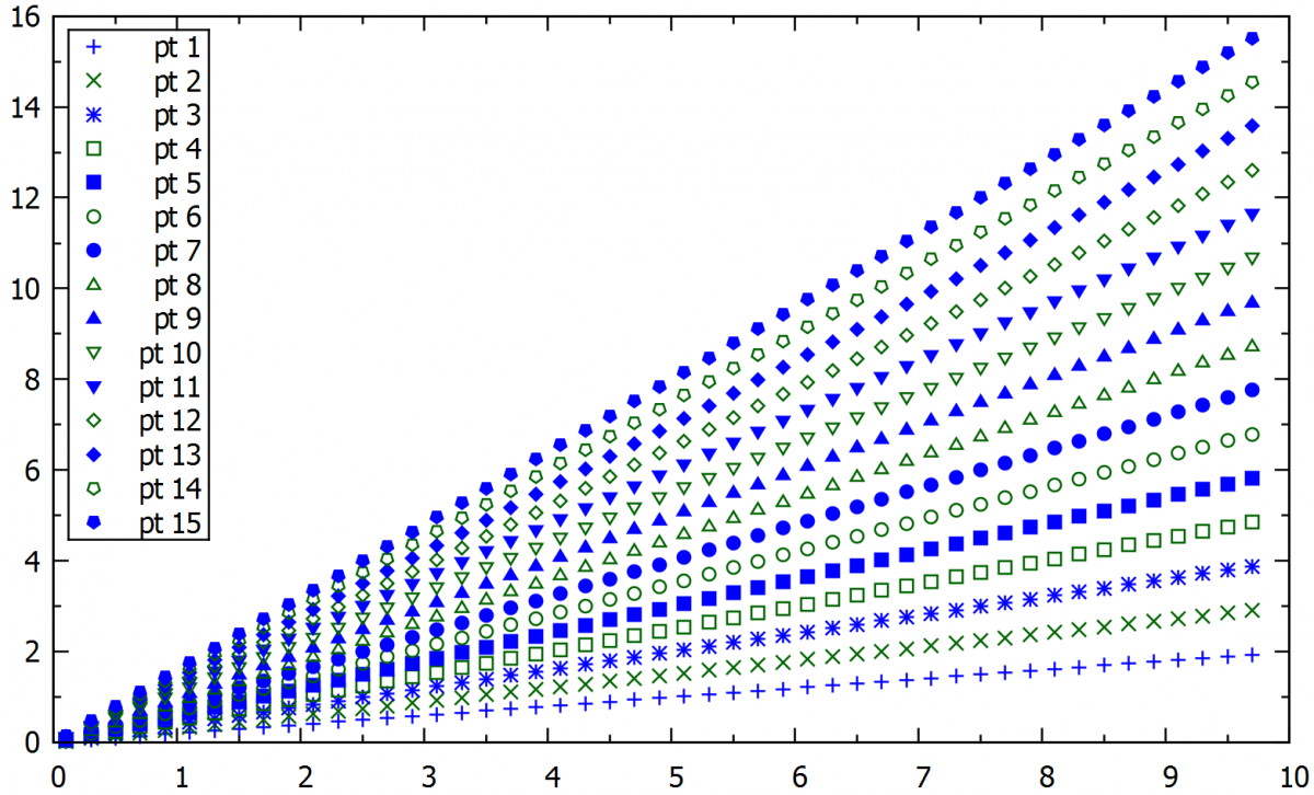
Command to define the pointsize. A recommended range is from 0.5 to 2.5:
- pointsize 0.7 / ps 0.7
Example:
plot "XXX.txt" u 1:2 w p ti "CH5" lc "dark-blue" pt 7 ps 0.3
This command will plot a blue pointed curve from the data file XXX.txt and named as a CH5 (channel 5).
4.2. Alternative way line type setting
We can define the point or line type in the separate command in the script and then just refer to this line type.
Command that sets the line style as being the pre-defined line type 1:
- set style line 1
Following command refers to the previously defined line type.
- linestyle 1 / ls 1
Example:
set style line 1 linecolor "dark-red" pt 7 ps 0.5
set style line 2 lc "dark-blue" pt 7 ps 0.5
plot "XXX.txt" using 1:2 with points title "CH1" linestyle 1
plot "YYY.txt" u 1:3 w p ti "CH2" ls 2
An example of a command that plots two different curves with two different line styles. The first two lines of the script define the line style, and in the plot command it is not necessary to refer to the point size and type, but only to the line style previously defined.
4.3. Adding a single point without a data file
Sometimes we need to add just a few points to the graph. In this case, it is not necessary to create a data file. We can add this point to the plot manually by writing its coordinates to the script.
- plot '-' w p ls 1, '-' w p ls 2, '-' w p ls 3
1 40
2 80
e
3 65
An example of the graph where the blue line is plotted from the data file and the red and green point is plotted separately. Red points were added together and the green point is separately.
Example:
plot "example1.txt" u 1:2 w p ti "Line 1 " lc "dark-blue" pt 7 ps 1.0, \
'-' w p ti "Red points " ls 1, '-' w p ti "Green point " ls 2,
3 40
7 90
e
5 65
An example of the graph where the blue line is plotted from the data file and the red and green point is plotted separately. Red points are making a curve together and the green point is plotted individually.
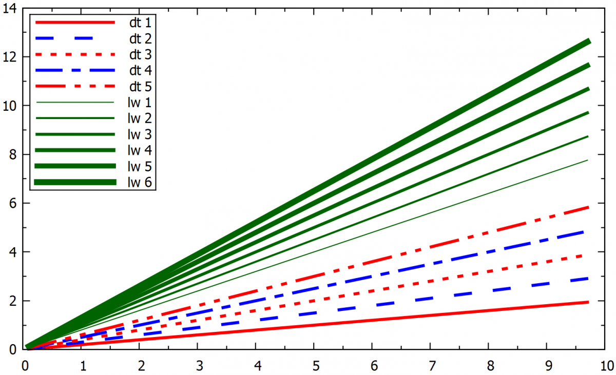
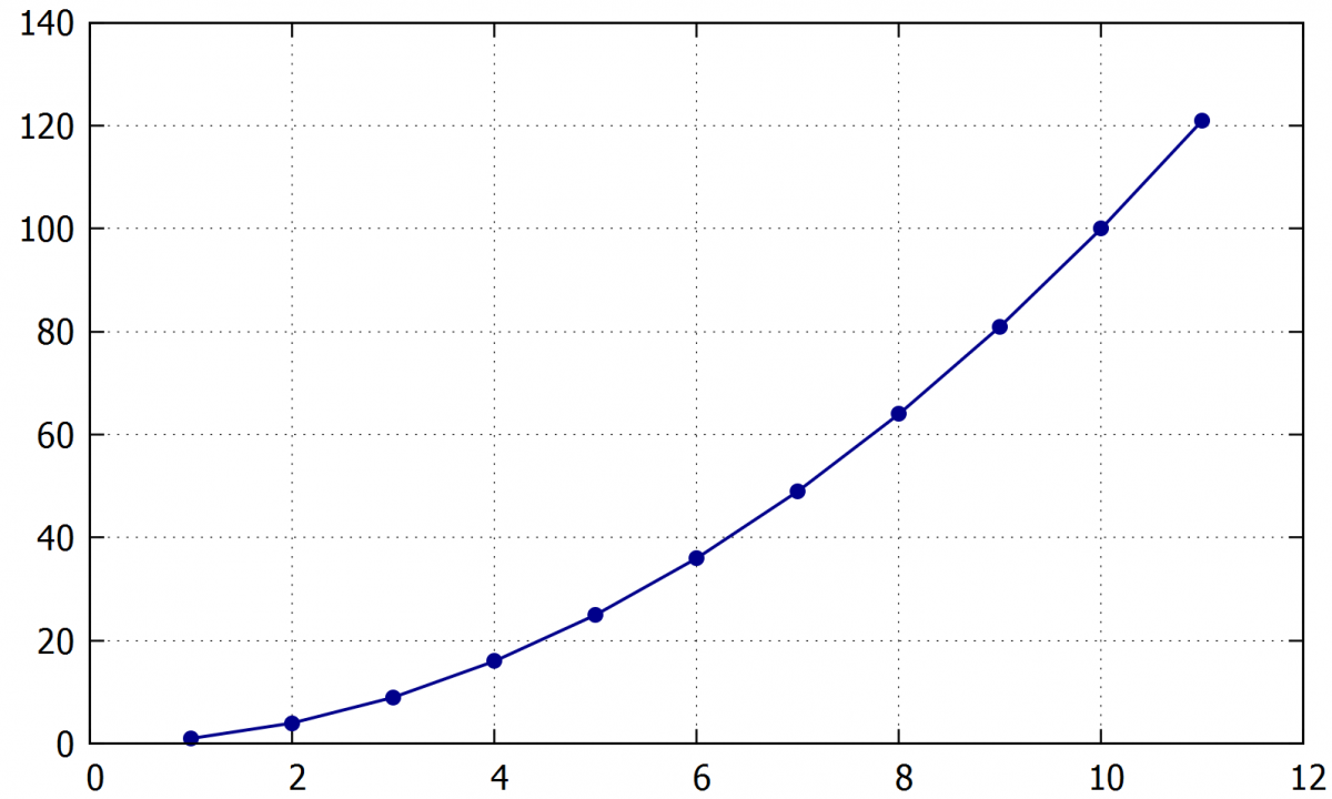
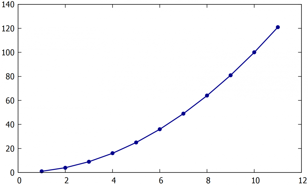
4.4. Line graph
Following command efines that the plot will use lines, and not points. The lines, in this case, will just connect the points in the data file.
- With lines / w l
Command for choosing the line width:
- Linewidth 2.0 / lw 2.0
Command for choosing a dashed line:
- Dashtype 1/ dt 1
The default type is a normal line corresponding to dash type 1. The next picture shows some line widths and types.
Example:
plot "example1.txt" u 1:2 w l ti "CH1" lc "dark-blue" lw 2.0 dt 2
Plots the curve from data file example1.txt , with a line of width 2.0 and dark blue colour. The same result can be obtained by defining the line style first and then referring to it in plotting command.
set style line 1 linecolor "dark-blue" lw 2.0 dt 2
plot "example1.txt" u 1:2 with lines ti "CH1" ls 1
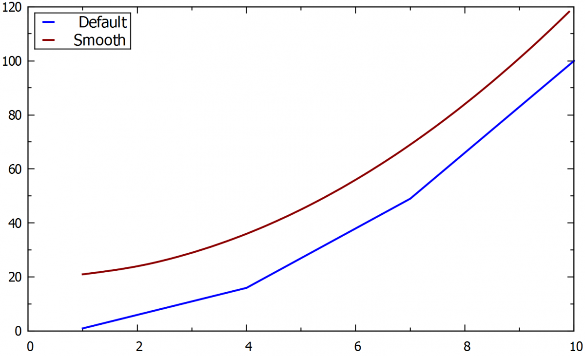
4.4.1. The smooth line
In some cases, it may be desirable to connect the points in the data file with a smooth line, as in the following command:
- smooth csplines (sbezier, beizer, acsplines)
This command shouldn’t be used if the exact values of the points are of interest, as the smoothing process distorts the final curve. The next plot shows the difference between normal and smoothed curves plot for the same data file.
Example:
plot "example1.txt" u 1:2 w l smooth csplines ti "Smooth " lc "dark-red" lw 2.0,
4.5. Lines points graph
Command for setting the curve as a line with visible points:
- With linespoints/ w lp
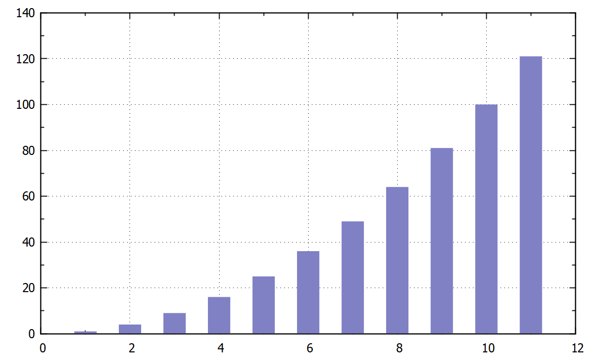
4.6. Histogram
Drawing the data as a histogram:
- with boxes
Histogram can be formatted by the following commands:
The columns width:
- set boxwidth 0.5
Empty columns (0.0) with borders:
- set style fill solid 0.0 border
Semi-transparent columns without borders:
- set style fill solid 0.5 noborder
Example:
A) set boxwidth 0.5
set style fill solid 0.5 noborder
plot "Example1.txt" u 1:2 with boxes " lc "dark-blue"
B) set style fill solid 0.0 border
plot "Example1.txt" using 1:2 with boxes ti "" lc "dark-blue" pt 7 lw 1.5,
|
|
 |
A) A semi-transparent histogram with width of 0.5.
B) A histogram with empty columns with blue borders and without spaces between columns.
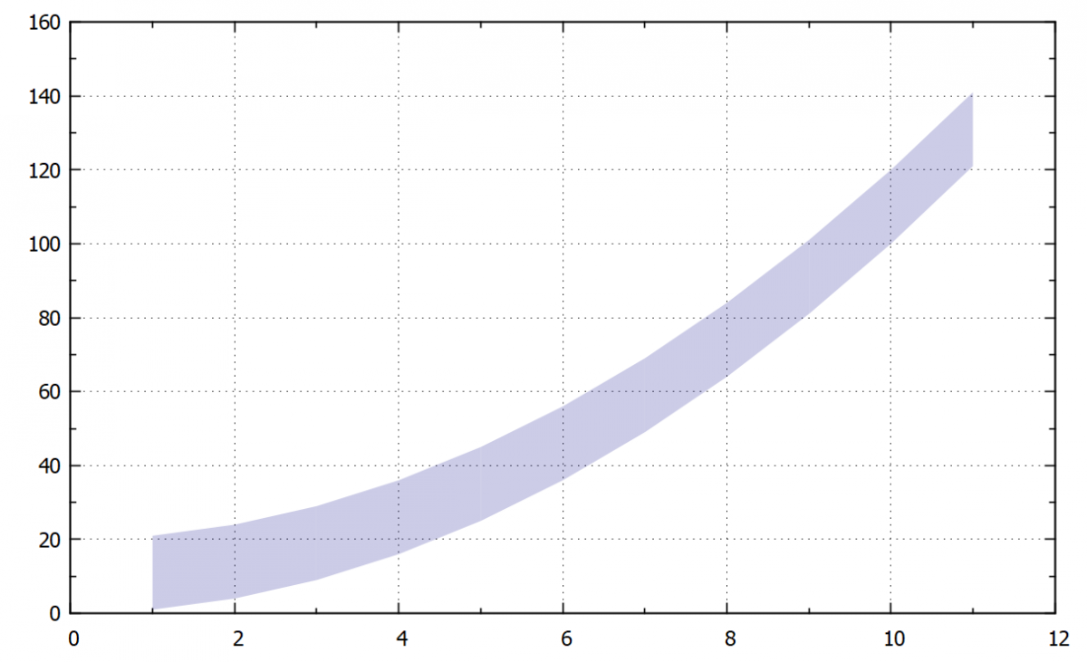
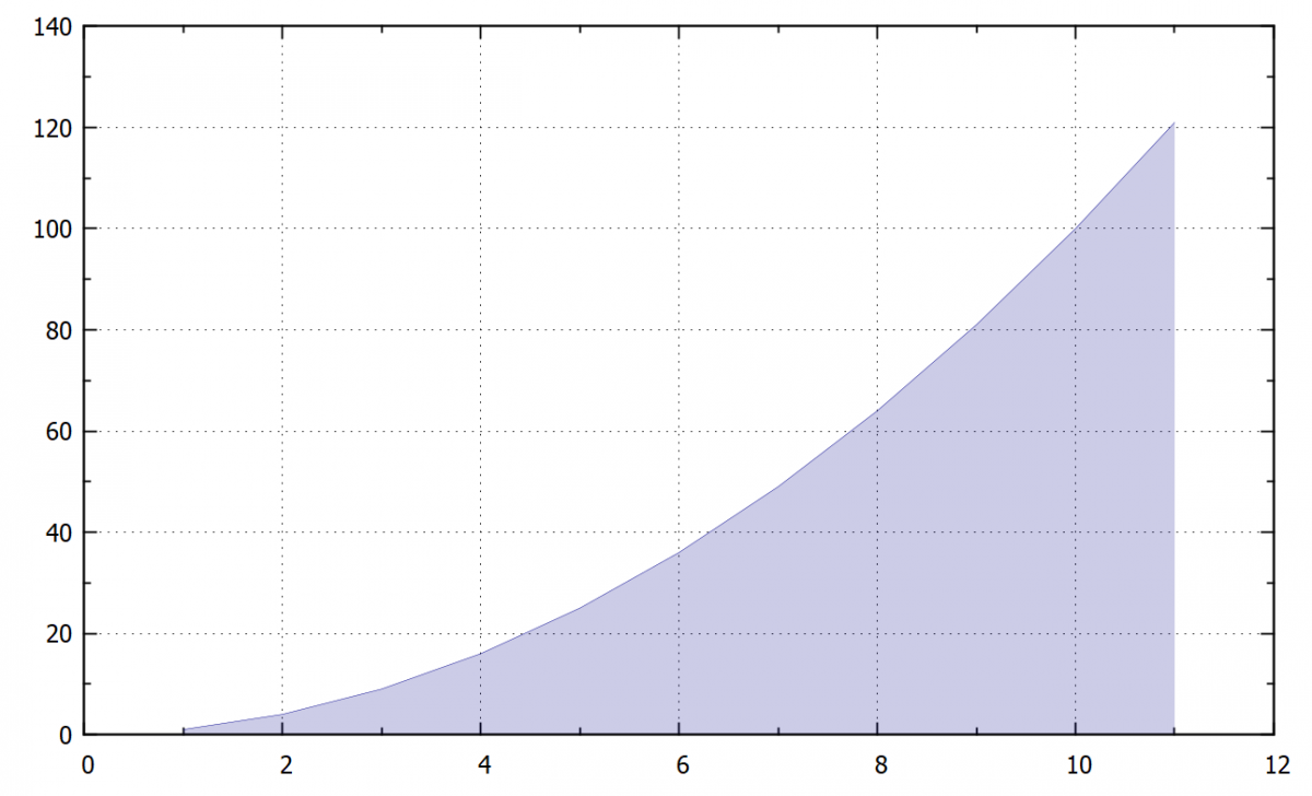
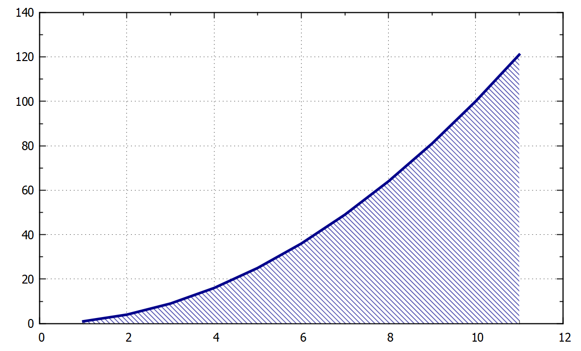
4.7. Filling of the area between two curves
If we need to fill the area between two curves, have both curves in the same data file with a common x-axis values, we can use the command:
- plot "XXX.txt" u 1:2:3 with filledcurves
This command loads columns 1, 2 and 3, where 1 is a common x-axis and columns 2 a 3 are y values for the curves.
Setting the transparency of filled area:
- Set style fill transparent solid 0.2
The value 0.2 corresponds to the transparency of 20 %. The default is a solid filling.
Example:
plot "XXX.txt" u 1:2:3 with filledcurves ti "CH1" lc "dark-blue"
set style fill transparent solid 0.2
 |
 |
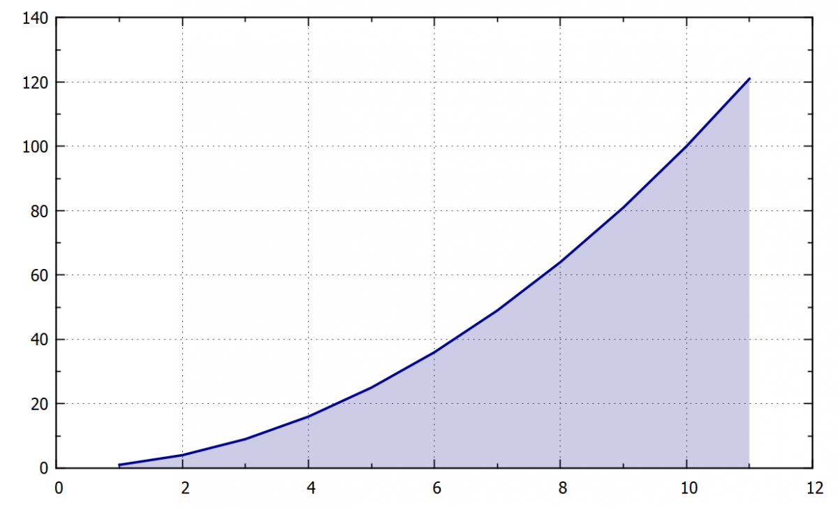
Following command fills the area between a curve and x1 (bottom horizontal axis). Also, we can use it for filling the area between another axis by replacing x1 for x2 (top horizontal axis) or y1 and y2 for left and right vertical axis.
- w filledcurve x1 (x2 ,y1 ,y2)
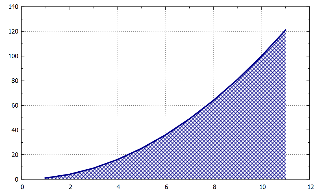
Tip: We can also plot the curve separately and then fill the area. An example of the plot with and without this visible curve is shown in the following example and figures.
Example:
A ) set style fill transparent solid 0.2
plot "example1.txt" u 1:2 with filledcurve x1 lc "dark-blue",
B) set style fill transparent solid 0.2
plot "example1.txt" u 1:2 with filledcurve x1 lc "dark-blue", \
"example1.txt" u 1:2 with lines lc "dark-blue" lw 2.0,
 |
 |
Also, we can fill an area between a curve and some specific number by the defining of this number on the axis x or y:
- w filledcurve y=100
The area is filled with a solid colour by using the pattern 1. Other options are type 2 a 3 (grid), 4, 5, 6 a 7 (hatching), 0 empty. These special types of filling cannot be combined with the transparency option.
- set style fill pattern 1
Example:
A) set style fill pattern 1
plot "example1.txt" u 1:2 with filledcurve x1 lc "dark-blue", \
"" u 1:2 with lines lc "dark-blue" lw 2.0,
B) set style fill pattern 6
plot "example1.txt" u 1:2 with filledcurve x1 lc "dark-blue", \
"" u 1:2 with lines lc "dark-blue" lw 2.0,
 |
 |
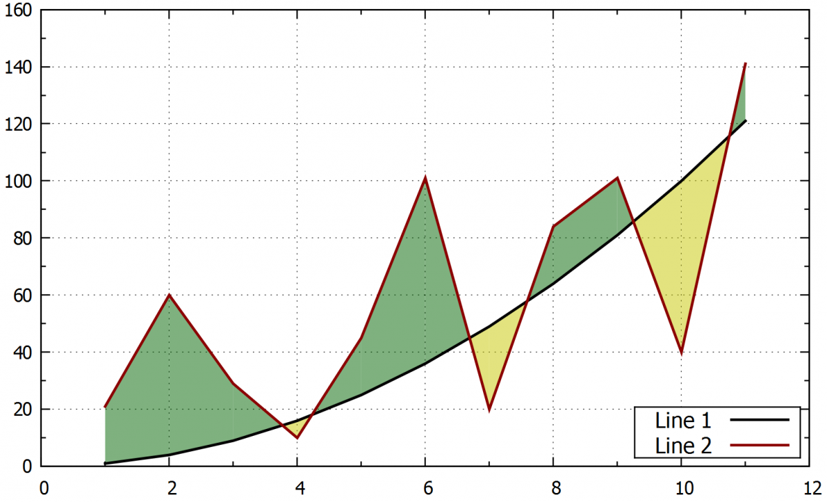
4.7.1. Different color above and below the curve
When lines are crossing each other we can fill the area between them with different colours above and below one of the curves.
Filling the area between the lines with different colours above and below:
- plot“XXX.txt“ u 1:2:3 w filledcurve above, „XXX.txt“ u 1:2:3 w filledcurve below
Example:
set style fill transparent solid 0.5
plot "example2.txt" u 1:2:3 w filledcurve above ti "" lc "dark-yellow", \
"example2.txt" u 1:2:3 w filledcurve below ti "" lc "dark-green", \
"example1.txt" u 1:2 w l ti "Line 1 " lc "black" lw 2.0, \
"example1.txt" u 1:3 w l ti "Line 2 " lc "dark-red" lw 2.0
5. Formatting the axes
Gnuplot provides several different options to format axes. Ranges, logarithmic and probability scale, space between values and manual addition of numbers in the axes can be set.
5.1. Axis range
5.1.1. Automatic range
The range will be set automatically for both axes based on the plotted data by using:
- set autoscale
The range is automatic only for one axis:
- set auto y
5.1.2. Semi-automatic
Following command sets a minimum/maximum value on the axis. The second value will be automatic according to the data range.
- set yrange [*:100]
- set yrange [-10:*]
5.1.3. Manual range
The range will be set manually. If the order of numbers is changed [higher:lower] the axis will be mirrored:
- set xrange [0:30]
- set yrange [0:100]
5.1.4. Logaritmic scale
Set or unset the logarithmic scale on the axes:
- set logscale y
- unset logscale
5.2. Numbers in the labels
5.2.1. Steps between the numbers
By default, the range is automatically based on the plotted data, but it can be personalized using the following command.
Comand for the step of 2.5:
- set xtics 2.5
5.2.2. Adding secondary scale marks between the principal numbers
This command adds second marks between the values on the axis. The number in the command is giving the number of sections. In this example, the principal scale mark will be divided by two.
- set mxtics 2
- set mytics 2
Example:
set xtics 2.5
set mxtics 5
The main step on x-axis was set manually to 2.5 and the sub-step was set to 0.5 by using the mxtics 5 option.
5.3. Formating of the numbers on the axis
The text font, size, colour and the numbers offset from the axes can be changed.
- set xtics font "Times-Roman, 20"
- set tics font ", 30"
- set tics textcolor "black"
- set xtics offset 0,1,0
- set ytics mirror / nomirror
The xtics command divides the x-axis, the tics divide the scale marks in both axes, the offset 0,1,0 sets an offset from the axis x, y, and z (only x and y for 2D graphs)
Example:
set xtics font "Times-Roman,12" tc "red" offset 0,-0.3 rotate by -30
The command defines a Times Roman font, size 12 in red colour, places the values in x further from the axis and sets a 30° rotation on the axis values.
5.4. Probability layout on y axis
For probability graphs (like probit functions), we can obtain a better resolution on the border regions by setting the probability layout in the y axis. The following commands do so.
Command for setting the probability layout on the y-axis:
- set yrange [invnorm(0.0001):invnorm(0.9999)]
Renaming the values on the axis manually to correspond to the probability layout:
- set ytics ("0.1" invnorm(0.001),"1" invnorm(0.01),"5" invnorm(0.05),\
"10" invnorm(0.1),"20" invnorm(0.2),"30" invnorm(0.3),\
"40" invnorm(0.4),"50" invnorm(0.5),"60" invnorm(0.6),\
"70" invnorm(0.7),"80" invnorm(0.8),"90" invnorm(0.9),\
"95" invnorm(0.95),"99" invnorm(0.99),"99.9" invnorm(0.999))
Plotting the curve in the probability layout:
- plot "XXXX.csv" using 2:(invnorm($1)) w p ti "Median " lc "blue" pt 1 ps 1.0,
Example:
set ytics ("0.1" invnorm(0.001),"1" invnorm(0.01),"5" invnorm(0.05),\
"10" invnorm(0.1),"20" invnorm(0.2),"30" invnorm(0.3),\
"40" invnorm(0.4),"50" invnorm(0.5),"60" invnorm(0.6),\
"70" invnorm(0.7),"80" invnorm(0.8),"90" invnorm(0.9),\
"95" invnorm(0.95),"99" invnorm(0.99),"99.9" invnorm(0.999))
set yrange [invnorm(0.0001):invnorm(0.9999)]
set logscale x
set xtics 10
set xrange [1:100]
plot "XXX.csv" using 2:(invnorm($1)) w p ti "Median " lc "blue" pt 1 ps 1.0, \
"" using 3:(invnorm($1)) w p ti "Lower limit " lc "dark-red" pt 1 ps 1.0, \
"" using 4:(invnorm($1)) w p ti "Upper limit " lc "dark-green" pt 1 ps 1.0,
|
|
|
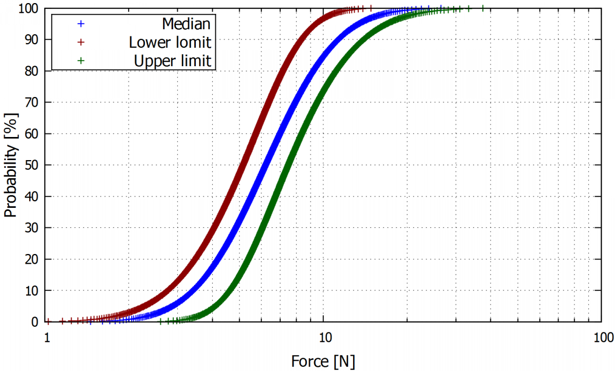
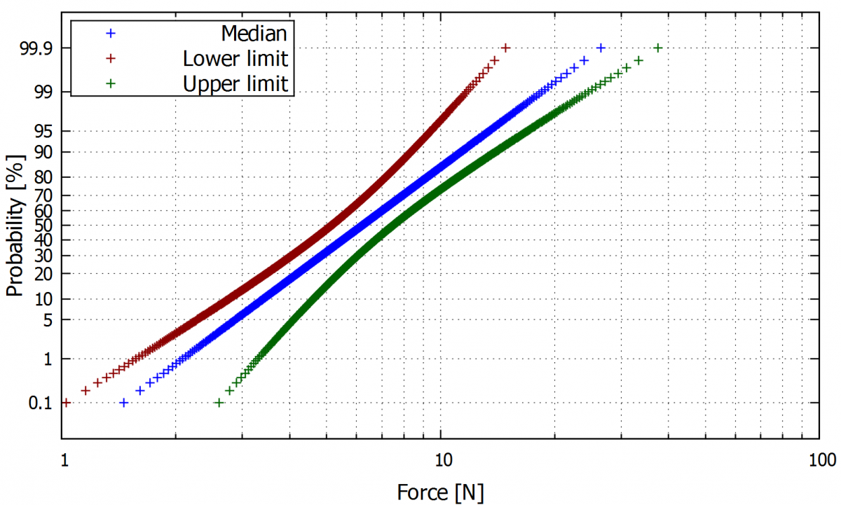
On the left is a plot in normal layout. A probit layout of the y-axis of the same curves is shown on the right.
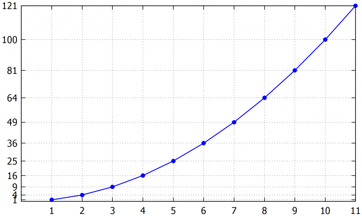
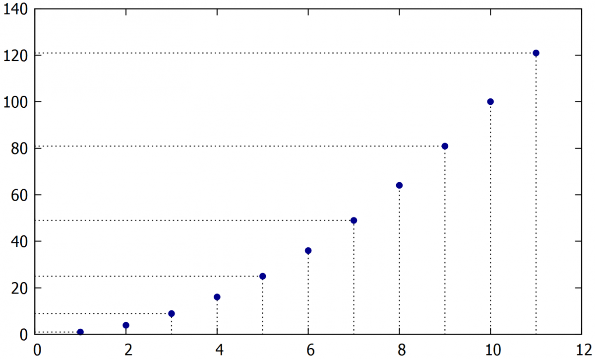
5.5. Numbering the axes based on the plotted values
Useful for making the individual points easy to read in special situations, the following command allows for numbering the axis to the plotted values.
Following command sets the step numbers on the y-axis to be equal to the intervals between the values in the data file.
-
p 'XXX.txt' u 1:2 w lp lc "dark-red" lw 1.5 ps 1.0 pt 7,
''u 1:(0):xticlabel(1) w p ps 0, ''u (0):2:yticlabel(2) w p ps 0
Example:
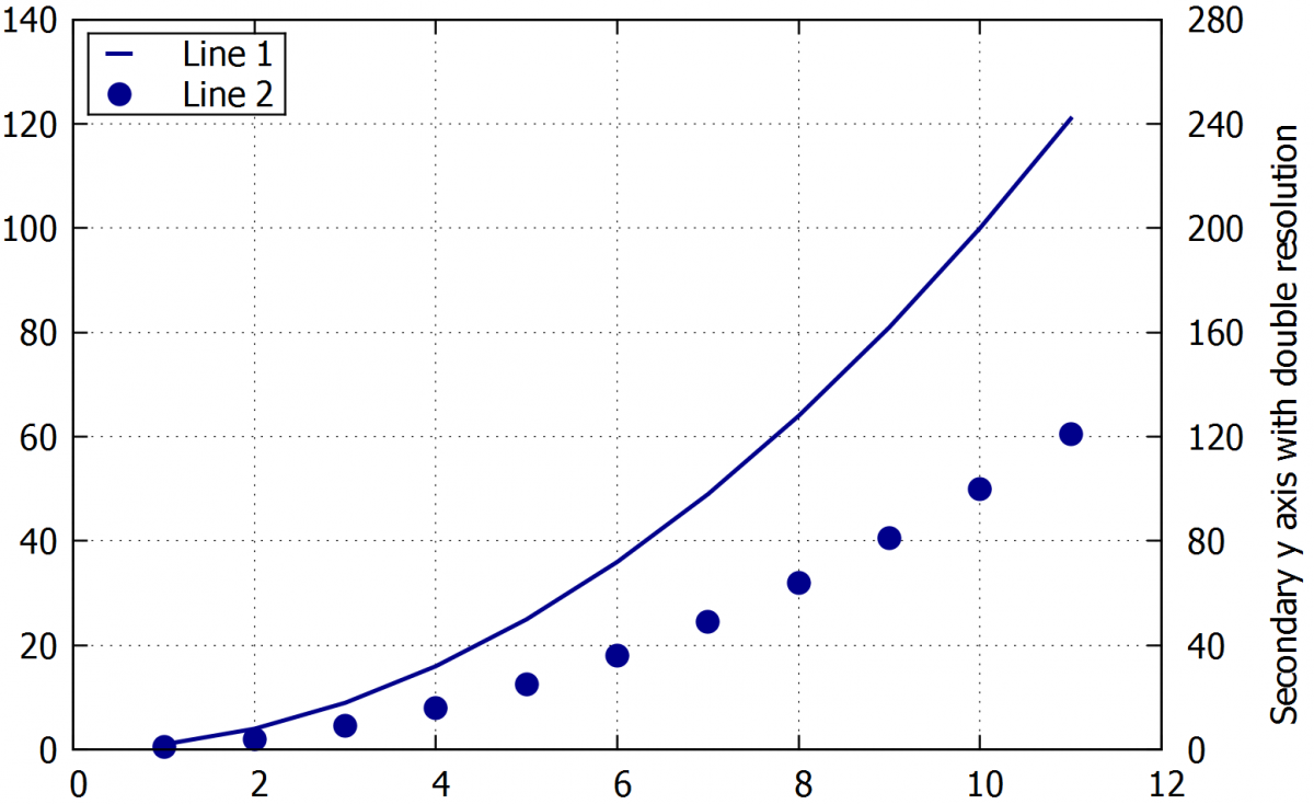
5.7. Secondary x or y-axis.
The values can be plotted in a second x or y-axis. An example is shown for the y-axis.
The range of secondary y axis:
- set y2range [XX:XX]
Command for displaying the numbers on the secondary y-axis:
- set y2tics
Names the axis y2:
- set y2label "Axis label"
Command for plotting of the data on the secondary y axis:
- plot „xxx.csv“ u 1:2 axes x1y2
Example:
set y2tics
set y2range [0:280]
set y2label "Name of the secondary axis "
set ytics nomirror
plot "XXX.txt" u 1:2 w p axes x1y2 ti "Line1 " lc "dark-blue" pt 7 ps 1.7,
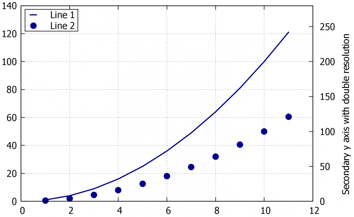
If we leave the y2 range in autoscale or don’t set the range carefully, the scale marks on the y2 may not coincide with the grid marks. An easy way to solve this issue is to use the command set y2tics to number the tics in the y2 axis using the same interval of the primary y-axis or a multiple of it.
Example:
set y2tics 40
set y2range [0:280]
set y2label "Name of the secondary axis with manual step"
plot "example1.txt" w l ti "Line 1 " lc "dark-blue" lw 2.0, \
"" u 1:2 w p axes x1y2 ti "Line 2 " lc "dark-blue" pt 7 ps 1.7,
6. Formatting labels, inserting extra labels, legend, and symbols
Gnuplot enables a number of options for formatting. Many types of labels can be set using a wide range of fonts, colours. ymbols, user notes and labels can be inserted to any place in the graph area.
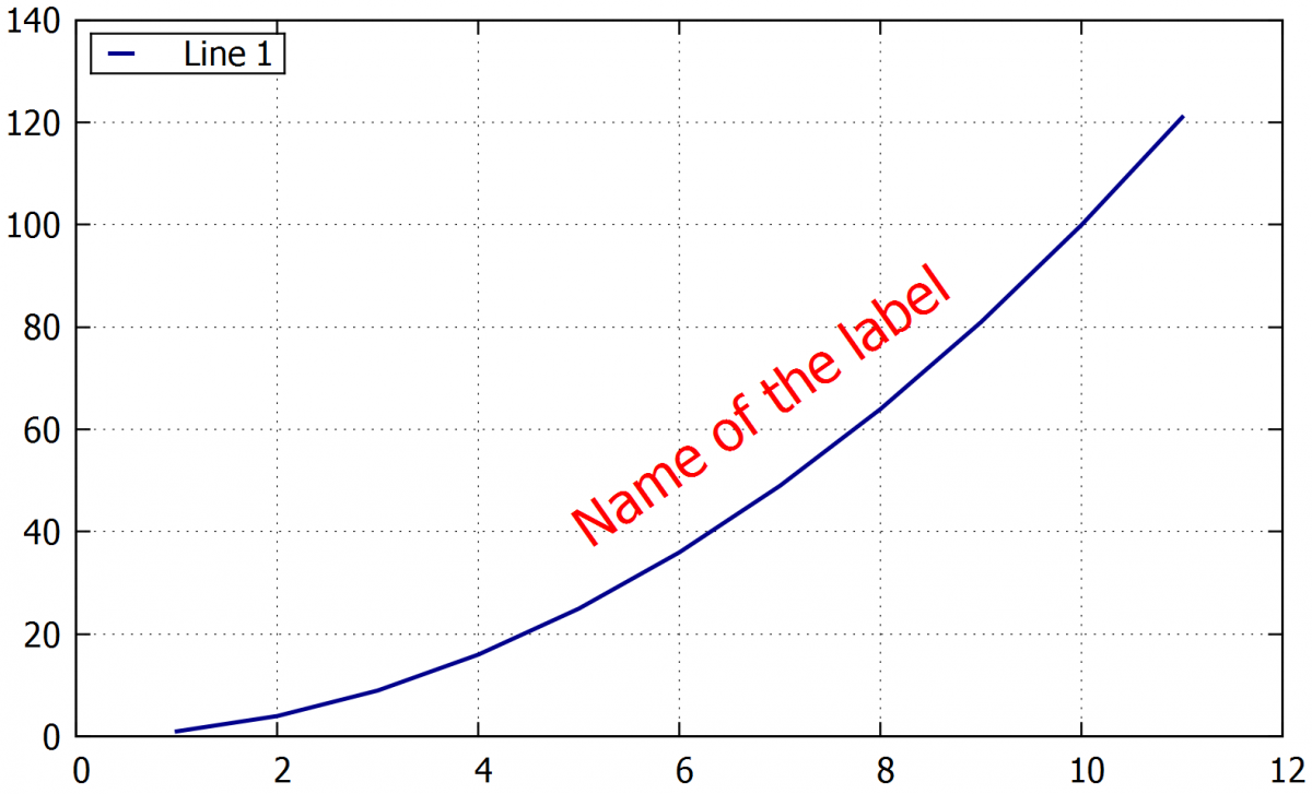
6.1. Inserting of labels
Setting the graph title:
- set title "Name of the plot" / set ti "Name of the plot"
By default, the title is placed above the graph area, but the following command allows it to be placed anywhere. The numbers are defining the x-y coordinates. The offset 2,0 can be used for both titles and labels positioning.
- offset 0,-5
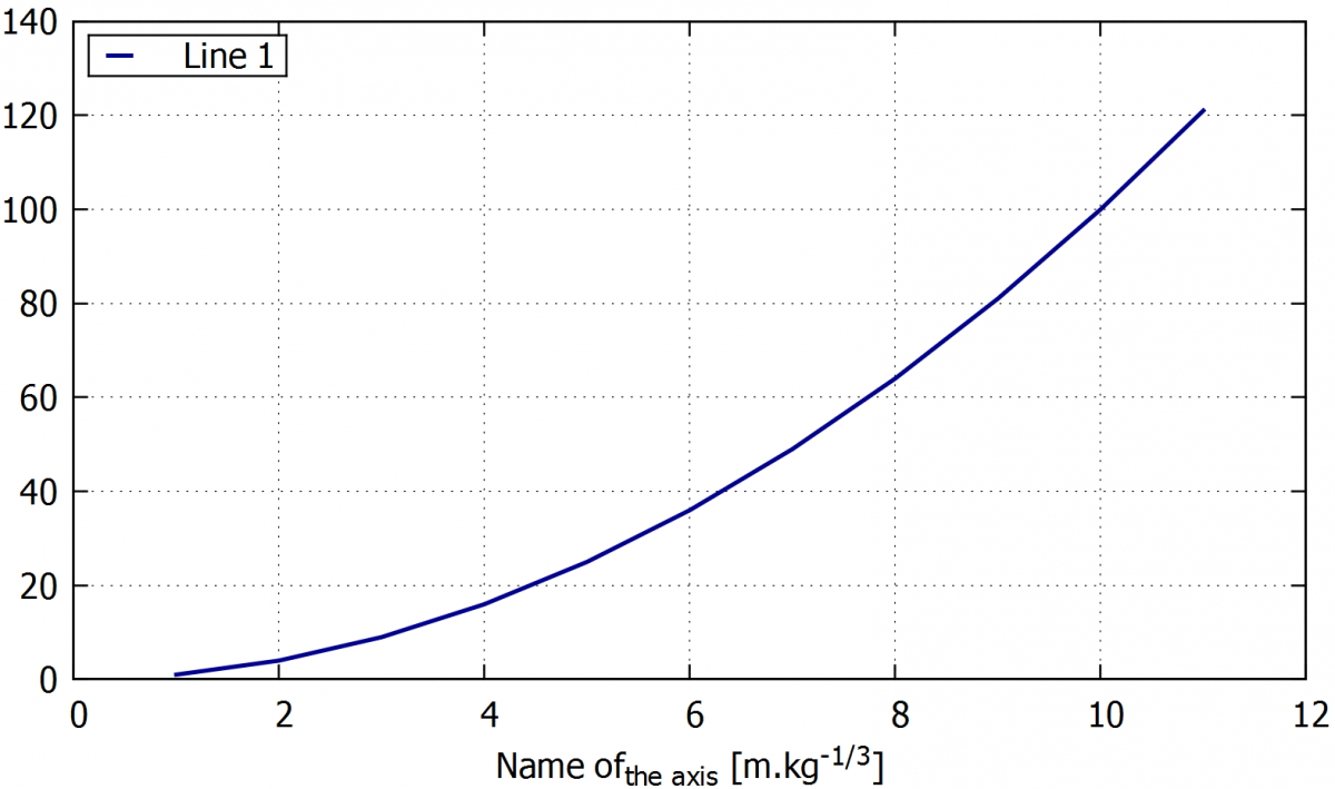
Inserting a label for x axis. The y label can be inserted in the same way by the command set ylabel:
- set xlabel "Name of the axis [unit]"
Adding a text label to the plot area. The numbers (at 0,0) define the label placement in x/y coordinates
- set label "Own label" at 0,0
Example:
set label 1 "Name of the label" at 5,40 rotate by 35 font "Times-Roman-bold,20" tc "red"
6.1.1. Formatting the labels
Choosing the labels font, size and also the bold letters can be applied:
- set ylabel font "Times-Roman-bold,10"
Rotatation the label in 45 degrees:
- set xlabel rotate by 45
Defines the color of the text in the label:
- set ylabel textcolor "red" / set ylabel tc "red"
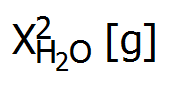
6.1.2. Writing indexes
Commands for upper and lower-case indexes (in this case the -1/3). Multiple indexes can be used as shown in the following commands.
- ^{-1/3}
- _{-1/3}
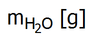
- _{H_{2}O} [g]
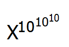
- ^{10^{10^{10}}}
If upper and lower-case indexes need to be added at the same time, we can use the following command:
- X@^2_y
Example:
A) set xlabel "Name of_{axis} [m.kg^{-1/3}]" font "Times-Roman-bold,12"
B) set xlabel "m_{H_{2}O} [g]"
C) set xlabel "X^{10^{10^{10}}}"
D) set xlabel "X@^2_{H_{2}O} [g]"
|
|
|
 |
6.1.3. Greek alphabet
Greek letters can be copied from another text source or inserted by the following command:
- set xlabel '{/Symbol a}' enhanced
Command for alpha α. Other Greek letters can be written by using the following table.
|
Letter |
Symbol |
Letter |
Symbol |
Letter |
Symbol |
Letter |
Symbol |
|
A |
Alpha |
N |
Nu |
a |
alpha |
n |
nu |
|
B |
Beta |
O |
Omicron |
b |
beta |
o |
omicron |
|
C |
Chi |
P |
Pi |
c |
chi |
p |
pi |
|
D |
Delta |
Q |
Theta |
d |
delta |
q |
theta |
|
E |
Epsilon |
R |
Rho |
e |
epsilon |
r |
rho |
|
F |
Phi |
S |
Sigma |
f |
phi |
s |
sigma |
|
G |
Gamma |
T |
Tau |
g |
gamma |
t |
tau |
|
H |
Eta |
U |
Upsilon |
h |
eta |
u |
upsilon |
|
I |
iota |
W |
Omega |
i |
iota |
w |
omega |
|
K |
Kappa |
X |
Xi |
k |
kappa |
x |
xi |
|
L |
Lambda |
Y |
Psi |
l |
lambda |
y |
psi |
|
M |
Mu |
Z |
Zeta |
m |
mu |
z |
zeta |
6.2. Deleting labels
Deleting the chosen label (graph title, axis label or some extra-label):
-
unset title
-
unset xlabel
- unset label 1
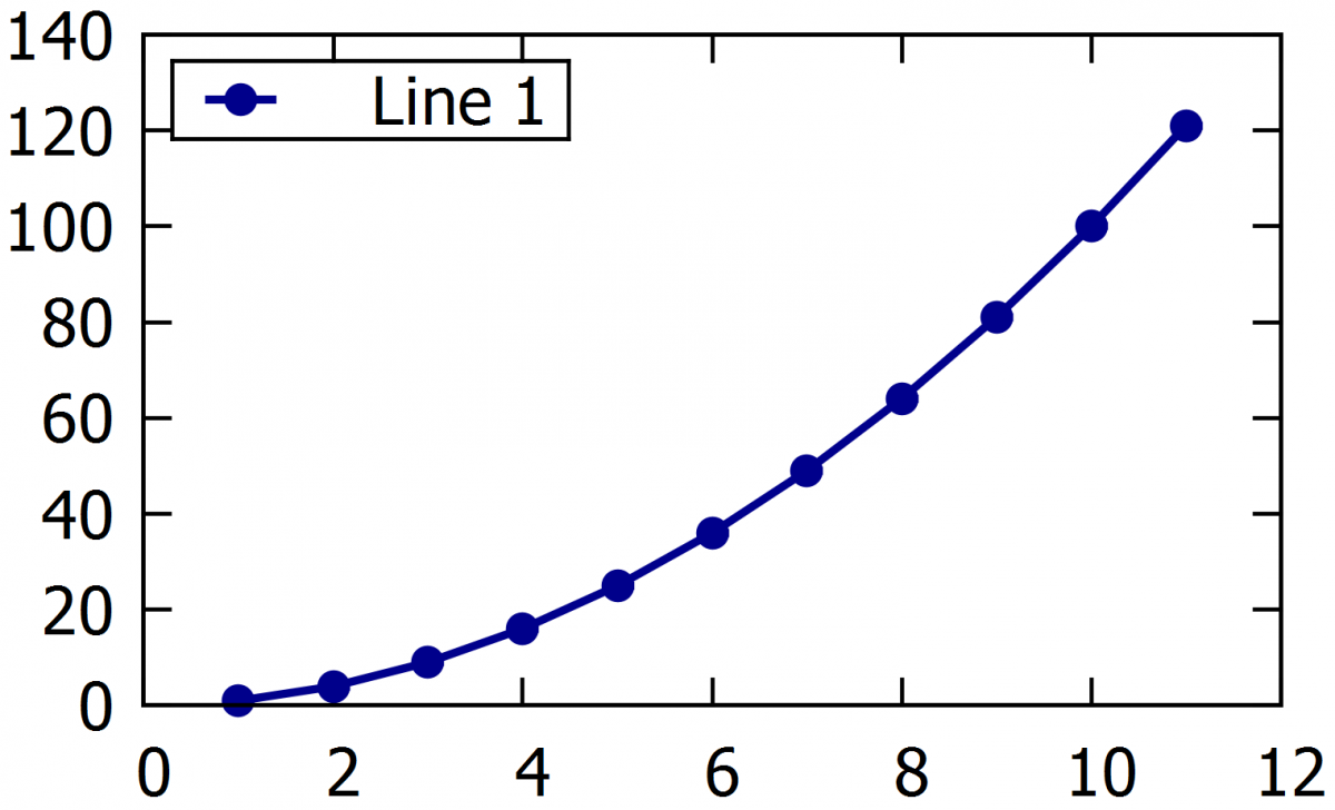
6.3. Inserting or deleting a legend
Inserting a legend
-
set key
Placing the symbol for the lines in the legend. Reverse = on the left of the label. The default is on the right.
- set key reverse
Places the legend outside the plot area:
- set key outside
Also, other positions can be obtained using the commands: left, right, top, bottom, center, inside, outside, lmargin, rmargin, tmargin, bmargin, above, over, below an under.
Manually places the legend at specific coordinates:
- set key at 20,300
Definition the legend borders type. The default is a solid line.
- set key box linestyle 1
Deleting a legend:
- unset key
6.3.1. Formatting the legend
Command defining the spacing between lines:
- set key spacing 1.5
Command for text color in the legend:
- set key textcolor "red"
Seting the font of the text in the legend.
- set key font "Times-Roman, 20"
The length of the line in the legend. Not applicable if point style used.
- set key samplen 5
Following command changes the width of the box around the legend. It is useful when the space between the symbol and the text is too big or small.
- set key width -5
By the command /n we can split the text in the label to more lines.
- ti "Text of first line \ntext vof sesond line "
Example:
A) set key font "Times-Roman,12"
set key box reverse top left samplen 5.0 spacing 1
B) set key font "Times-Roman,12" tc "dark-red"
set key box linestyle 0 reverse top right outside samplen 1.0 spacing 2
|
|
|
Example of difetent types of legend..
Tip: If we don't want to show one or more curves in the legend, we can simply write empty quotation marks when defining the curve title (ti "").
6.3.2. Changing the line symbol thickness in the legend
If we are plotting curves as thin lines, it is possible that the lines become difficult to distinguish from each other in the legend. We can obtain a thicker line of legend by saving a thick line in the plot using a ghost curve, and hiding the thin line title in the legend (using ti “”). For creating this curve we have to use the every command to plot every x-th point where x needs to be bigger than the number of lines in the loaded data file (etc. every 10000 for a data file with 1000 lines). Then this curve cannot be plotted but it will be shown in the legend.
Example:
A) plot "example1.txt" u 1:2 w l ti "Line1 " lc "blue" lw 1.0, \
B) plot "example1.txt" u 1:2 w l ti "" lc "blue" lw 1.0, \
"" u 1:2 every 100 w l ti "Line1 " lc "blue" lw 3.0,
|
|
|
The example shows how to draw a thicker line to the legend when we are plotting a thin line. This trick brings us a easier recognicing of the lines in legend when they are plotted with very thin line so it is difficult to recognize them.
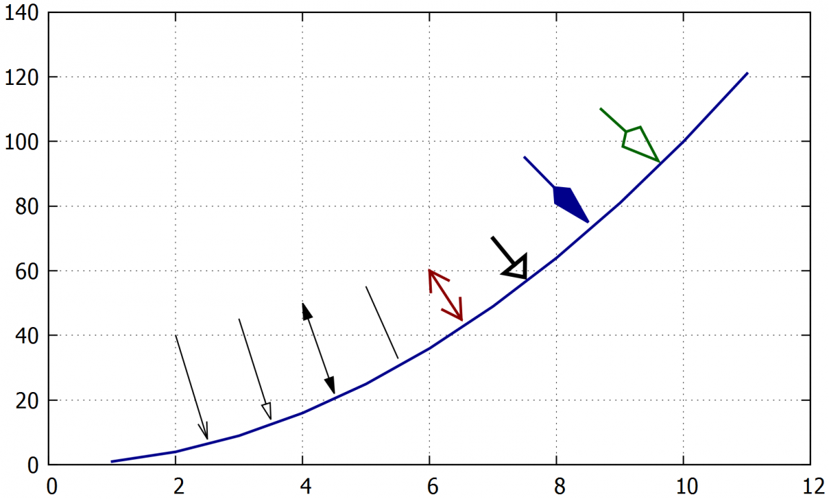
6.4. Inserting an arrow
An arrow or a line (an arrow without head) can be inserted in any position of the graph. Similar commands are also used to add borders manually and to break the axis.
Inserting an arrow, where XX and YY are defining the placement of the head and end of the arrow.
-
set arrow 1 from XX, YY to XX, YY lw 1
The arrow type can be chosen from these options. Empty means the head will be unfilled, nohead means the simple line, heads sets two heads on both ends of the line (double arrow) and filled fills the arrow head.
- empty, filled, nohead, heads
Setting the arrow parameters. The first number is the size and the second number is its width.
- size screen 0.045,15,500
An alternative way to set the arrow position. The coordinates are defined for the arrow end, and an angle can also be set.
- set arrow 5 from 64,-0.01, graph 0 length 1.0 angle 75 empty lw 2 front
Example:
set arrow 1 from 2, 40 to 2.5, 8 lw 1
set arrow 2 from 3, 45 to 3.5, 14 lw 1 empty
set arrow 3 from 4, 50 to 4.5, 22 lw 1 heads filled
set arrow 4 from 5, 55 to 5.5, 33 lw 1 nohead
set arrow 5 from 6, 60 to 6.5, 45 lw 2 lc "dark-red" heads size screen 0.025,30,45
set arrow 6 from 7, 70 to 7.5, 58 lw 3 empty size screen 0.025,40,20
set arrow 7 from 7.5, 95 to 8.5, 75 lw 2 lc "dark-blue" filled size screen 0.045,15,500
set arrow 8 from 8.7, 110 to 9.6, 94 lw 2 lc "dark-green" empty size screen 0.045,20,300
7. Graph borders
Border formatting is especially useful for 3D plots, multi-plots, and plots with broken axis. By default, the graphs have four borders, but in this chapter, we describe how to hide the plot borders completely or partially.
Setting the borders manually. The command 1+2 shows only x and y-axes, 1+2+4+8 shows again the four sides border (default) and 1+2+4+8+16+32+64+256+512 shows full borders for 3D graphs.
- set border 1+2
Deleting all borders, including x and y-axes.
- unset border
Example:
A) set xtics nomirror
set ytics nomirror
set border 1+2
B) set xtics mirror
set ytics mirror
set border 1+2+4+8
|
|
|

8. Editing the background
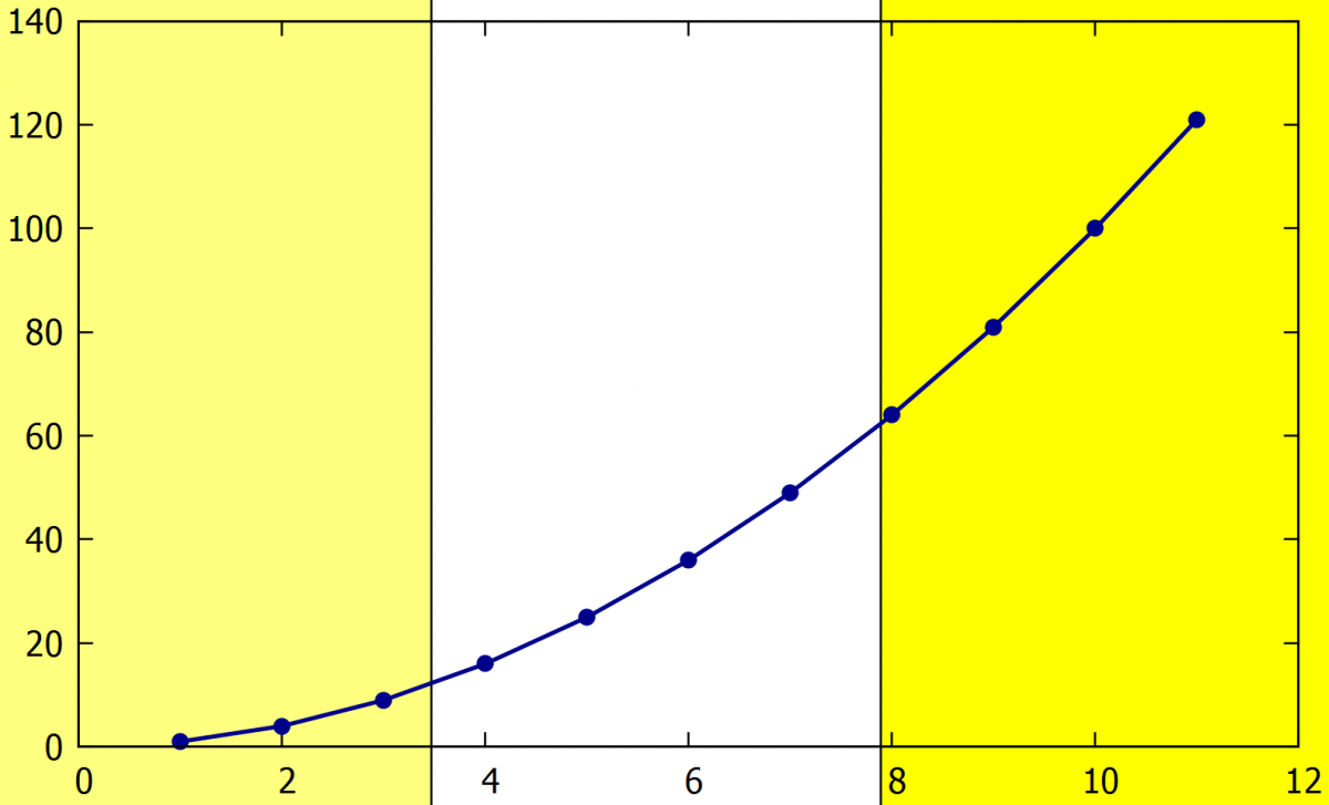
By default, the background is white. If another colour is wanted, a coloured object occupying the entire graph area can be inserted as a background. Optionally, only part of the area can be colored by changing the object size. The object can be set to have any transparency, to adjust the background colour tone. Only rectangle, circle and ellipse are directly supported by the software, but other shapes like triangle can be obtained by filling the area between lines.
- set object rectangle at XX, YY
Inserts a rectangle at coordinates XX, YY. Also, circles and ellipses can be used writing set obj circle or obj ellipse.
- set object 1 rect from screen 0,0 to screen 1,1 fillcolor "yellow" behind fillstyle transparent solid 0.5
Inserts a yellow rectangle as the background of the entire graph (can be set by the coordinates 0,0 and 1,1). It is important is to to use "behind" that moves the object to the back.
Example:
A) set object 1 rectangle from screen 0,0 to screen 0.33,1 fillcolor "yellow" behind fillstyle transparent solid 0.5
set object 2 rectangle from screen 0.66,0 to screen 1,1 fillcolor "yellow" behind fillstyle transparent solid 1
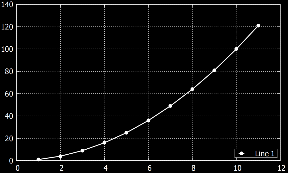
B) set xlabel font "Times-Roman,12" tc "white"
set ylabel font "Times-Roman,12" tc "white"
set grid ytics xtics ls 0 lw 1 lc "white"
set tics font "Times-Roman,12" tc "white"
set key font "Times-Roman,12" tc "white"
set key reverse bottom right samplen 0.5 spacing 1
set key box lc "white"
set object 1 rectangle from screen 0,0 to screen 1,1 fillcolor "black" behind fillstyle transparent solid 1
|
|
|
9. Grid settings
A grid can be added to improve the graph reading and in this chapter, we will show how to insert and change the grid parameters.
9.1. Basic grid
Inserting a grid with the dashed line of linewidth 1. Line type ls -1 is the normal line and ls 0 is a dashed line:
-
Set grid ls 0 lw 1
Deleting the grid:
- Unset grid
Setting a grid for the x or y values individually:
- set grid xtics
- set grid ytics
Inserting a grid also for the secondary values on the axes:
- set grid mxtics
- set grid mytics
Command places the grid on the front or back of the plot:
- front/back
Example:
A) set grid ytics xtics ls 0 lw 1 lc "black"
set grid mxtics
B) set style line 1 lc 'black' lt 0 lw 1
set style line 2 lc 'red' lt 1 lw 1
set grid xtics ytics mxtics ls 1, ls 2
|
|
|
Two examples of grids without (left fig) and with (right fig) the lines for the secondary values on the x-axis. The second figure the secondary grid is set to red color.
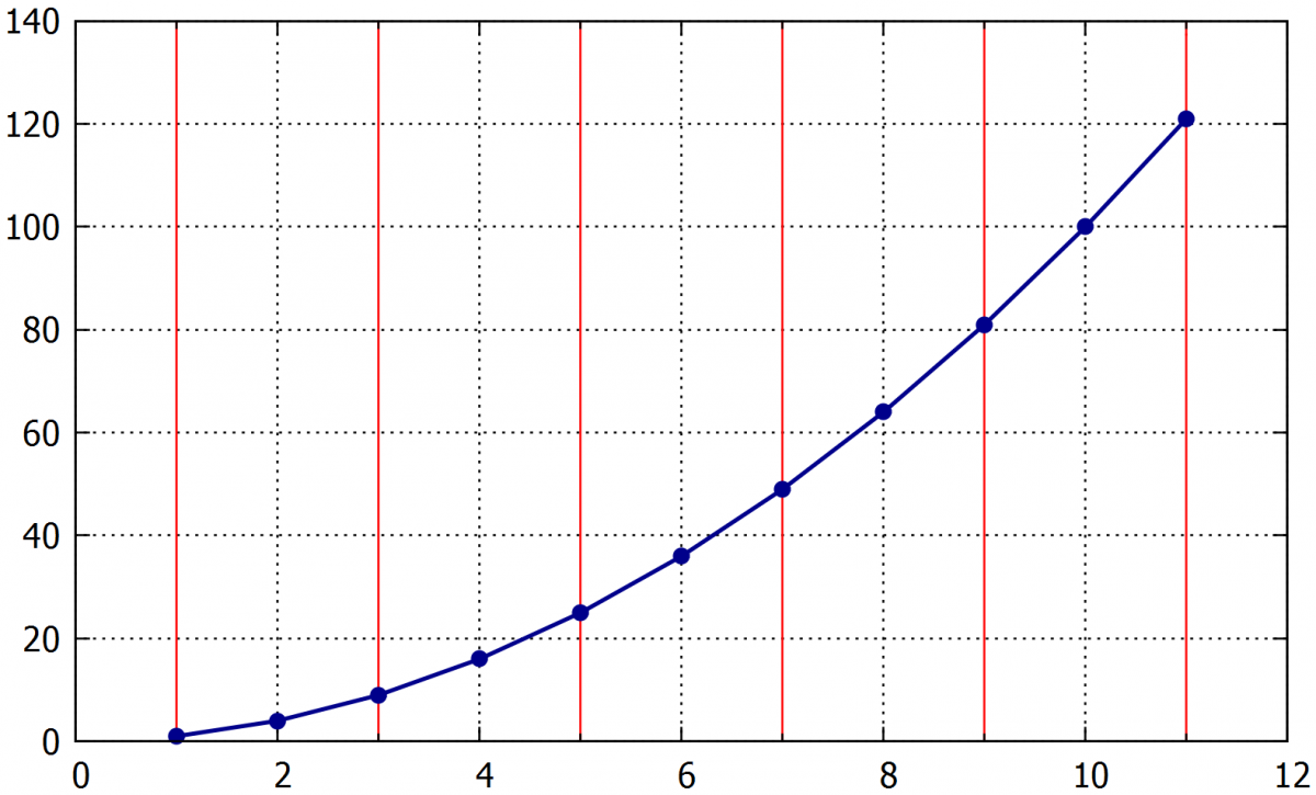
9.2. The grid corresponding to the values in data file
Command for setting the horizontal grid lines parameters:
-
p 'example1.txt' u 1:2:(0):1 w xerror ps 0 lt 0 lw 1 lc rgb "black", \
Command for setting the vertical grid lines parameters:
- '' u 1:2 w i lt 0 lw 1 lc rgb "black", \
The every x command can be set to use only every x-th value.
Example:
p 'example1.txt' u 1:2:(0):1 every 2 w xerror ps 0 lt 0 lw 1 lc rgb "black" ti "", \
'' u 1:2 w i lt 0 lw 1 lc rgb "black" ti "", \
'' u 1:2 w p ti "Křivka1" lc "dark-blue" ps 1 pt 7,
10. Shifting the data in X-Y coordinates
Sometimes we need to shift the data by some value on one or two axes (eg. shift in time for comparison of two curves, or shifting the curves to start at zero).
10.1. Shift on the x axis
The command to add a chosen value (0.0015) to all values in the x-axis. Its necessary to add the symbol $ before the column that will be changed:
- plot "XXX.csv" u ($1+0.0015):2
10.2. Shift on the y axis
The same as for the x-axis but choosing the second axis:
- plot "XXX.csv" u 1:($2+0.0015)
10.3. Multiplying axis
Multiplying works in the same ways as for addition. Division can also be done:
- plot "XXX.csv" u ($1*1000):2
Example:
p ' XXX.txt' u 1:2 w l ti "Line1 in cm " lc "dark-blue" lw 2.0, \
' XXX.txt' u 1:($2*10) w p axes x1y2 ti "Line 2 in mm " lc "dark-red" pt 7 ps 1.7, \
' XX.txt' u ($1-1):2 w l ti "Line 3 from zero " lc "dark-green" lw 2.0,
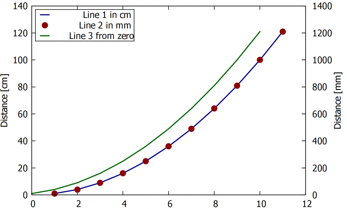
The blue line is the for the distance in centimeters and the red pointed line is on the secondary y-axis in millimeters. The green line is shifted to the zero on the x-axis.
11. Changing the decimal separator
The default for the decimal separator in gnuplot is a dot. If we want to use a comma instead of the dot, we can simply switch to it by the following commands.
Shows actual decimalsign:
- show decimalsign
Setting a comma as a decimalsign:
- set decimalsign ','
Following command sets the default decimalsign (dot):
- unset decimalsign
Another option to solve possible incompatibilities of decimal separator between data files and the Gnuplot software is to change the datafile decimal separator. It can be done directly from the original data file generator (eg in Octave, Matlab) or later using text editors (eg. Notepad++, VIM).
12. Saving the plots
The easiest way to save a plot is to use the icon on the top of Gnuplot panel, that saves it as a plt file. However, we can also save the plot in some different format like png or pdf.
12.1. Saving as a pdf
At the beginning of the script, we have to define the terminal for saving to .pdf. The default terminal is wxt, that is showing the plots in new windows. After this change, the new window with the plot wouldn't appear, but the plot will be saved as a .pdf document in the folder that contains the script. The name of the document can be set by the set output command.
- set term pdf
- set output "Graph.pdf"
- set output
12.2. Saving as png
Similarly to pdf saving, using the following commands:
- Set output „Graph.png“
- Set output
12.3. Saving on the wxt terminal
This is the easiest way how to save a graph. However, the resolution of the saved picture is affected by the size of the window. It means that if we save a graph in the full-screen window the resolution will be the better than for smaller windows.
Example:
|
|
|

Also important, if we change a window size and then replot the graph without closing the previous window, labels and curves size change, as shown in following the example.
Example:
|
|
|
In the left figure, the window was scaled down before replotting, what led to the labels being bigger. The opposite happened for the figure on the right when the window was maximized before the graph was replotted.
13. Examples of advanced plotting
In previous chapters, simple examples were shown. It would be possible to plot most of them in several other software. However, some more complex plots are not very easily obtained using the basic software. This chapter shows some examples of more advanced plotting capabilities of Gnuplot, that are very useful in scientific graphs.
13.1. Spectrogram
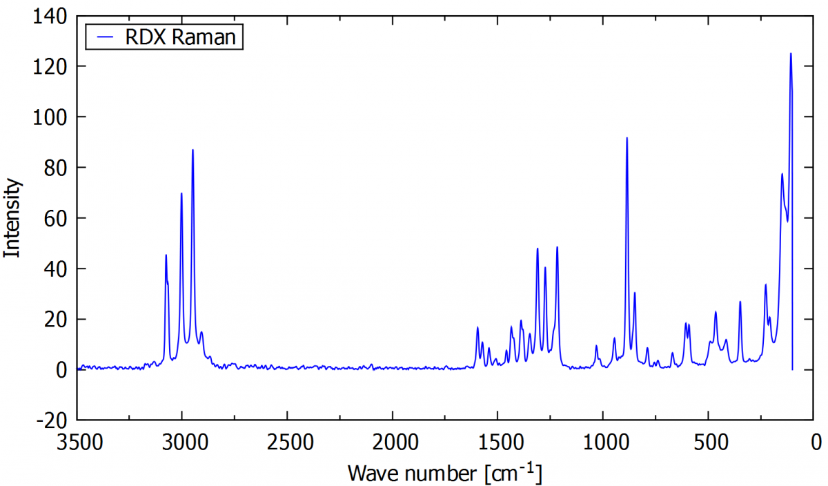
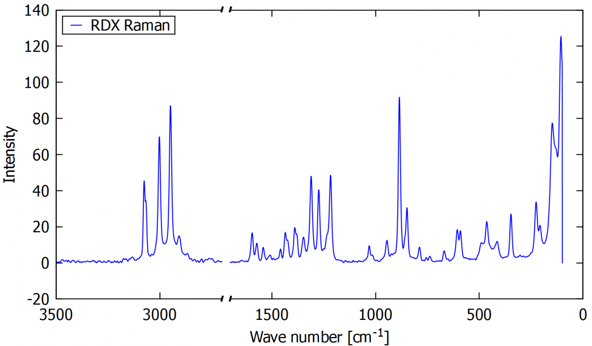
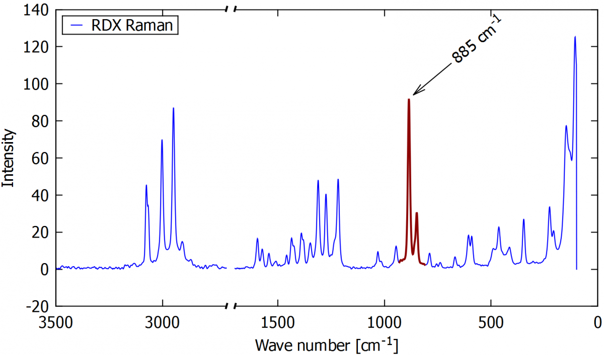
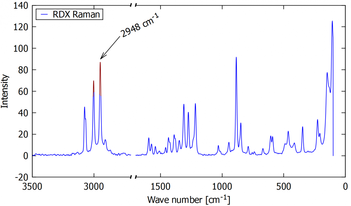
In spectrograms, it's interesting to be able to highlight some specific part of the curve. In gnuplot, we are able to point out parts of the spectrogram or cut out some wave numbers where there are no peaks. The following examples show RDX spectrogram, edited in a few different ways.
|
|
|
| The default Raman spectrum (script for this plot is available here) | Spectrum with broken axis in wave number range of 1700 and 2700 cm-1 (script for this plot is available here) |
|
|
|
| Spectrum with highlighted peak in some wave number (script for this plot is available here) | Spectrum with highlighted tops of peaks in some x-axis range. Tips are highlighted only if they are over some intensity (script for this plot is available here) |
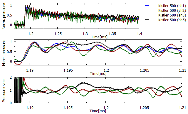
13.2. Multiplot
Multiplot is a specific type of graph that includes two or more subplots. We can create any combination of subplots in one, such as a graph with three subplots under one other or a smaller plot inside the main graph area to show a curve detail.
To multiplot is necessary to divide the graph area into subsections. In the following example, three subsections are defined, and three graphs are added independently. As the multiplot is complex to so, the commands won’t be described here, but it is available in the link below the figure.
|
|
|
A time-pressure history from pressure sensors in different positions (script for this plot is available here) |
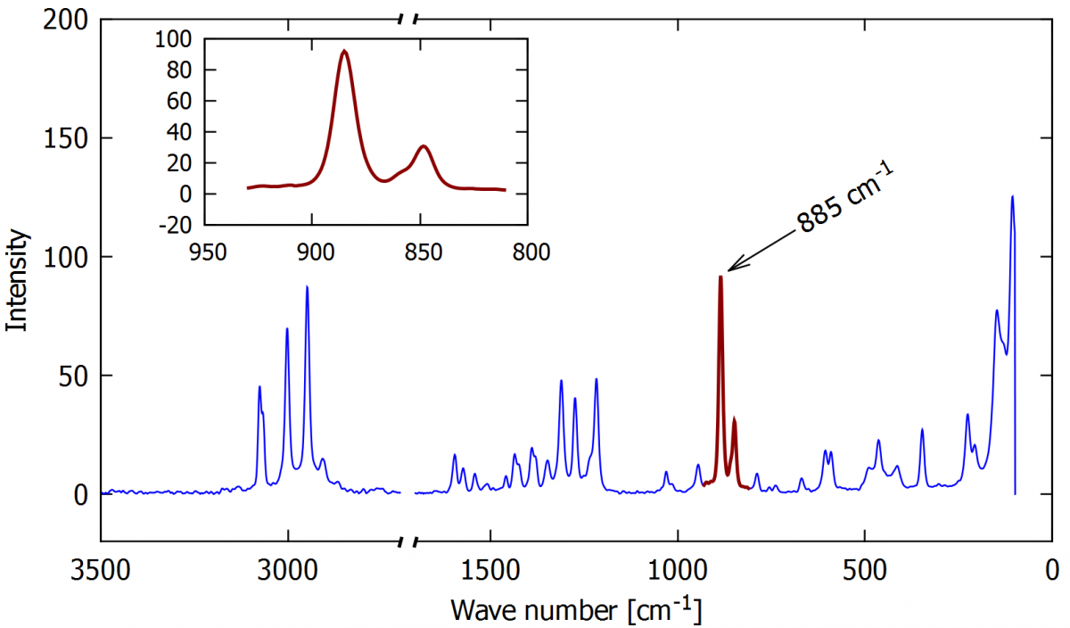
13.3. The inserting a smaller subplot
Example of a small subplot giving details of a peak in a spectrogram.
|
|
| Raman spectrum of RDX with a detail of the red peak in the inserted subplot (script for this plot is available here) |
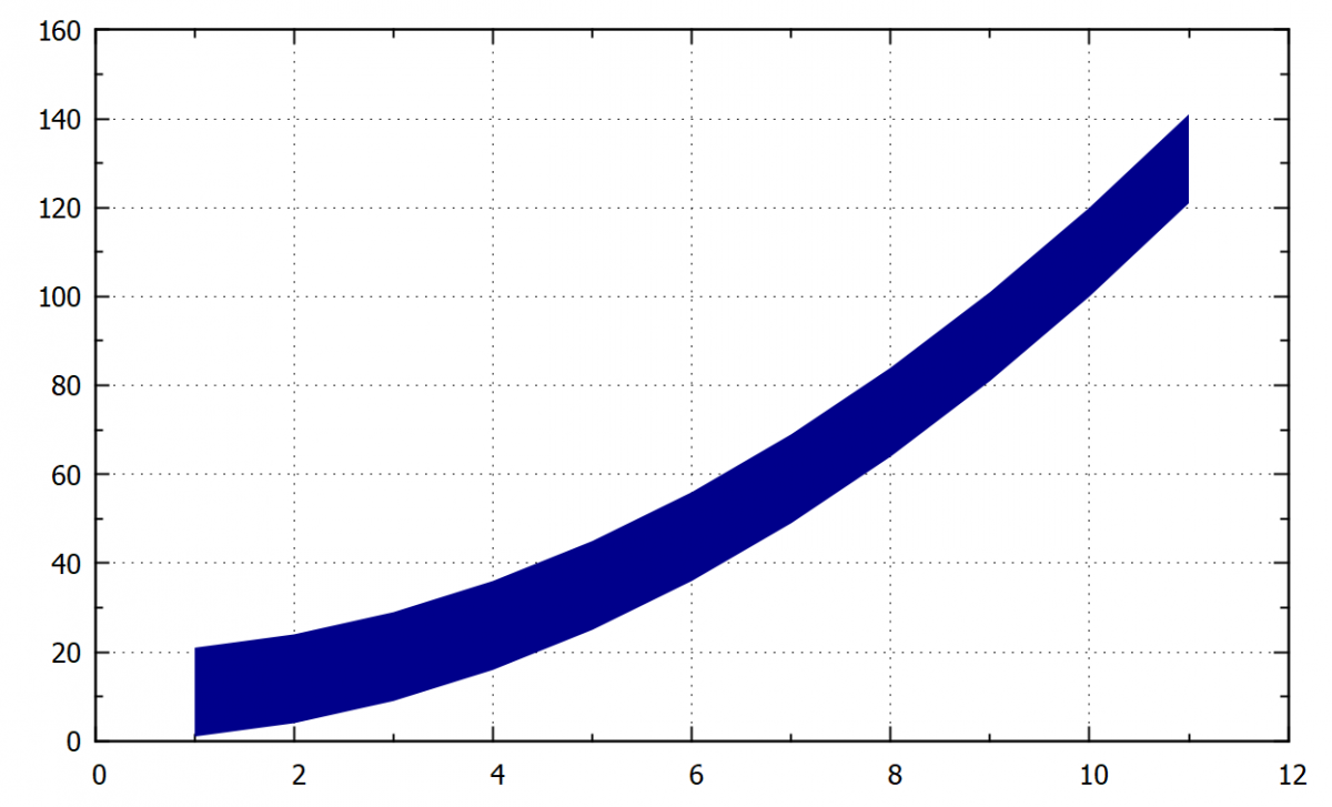
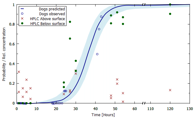
13.4. Filling the area between curves when the data for the two curves are not in the same data file
In this example, the filled area arround the curve corresponds to the experimental error.
|
|
| The probability of a sniffing dog to find a chemical sample (script for this plot is available here) |
13.5. 3D graphs
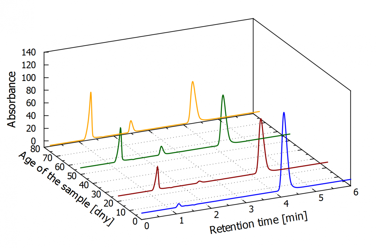
Sometimes it is interesting to present the data in 3D graphs. The following example shows the chromatogram for the aging of PGDN, in four aging time periods, in a 2D graph with absorbance and reaction time as the axes variables. Every aging period is represented as a separated curve, and they needed to be shifted by 100 absorption units to enable comparison between them.
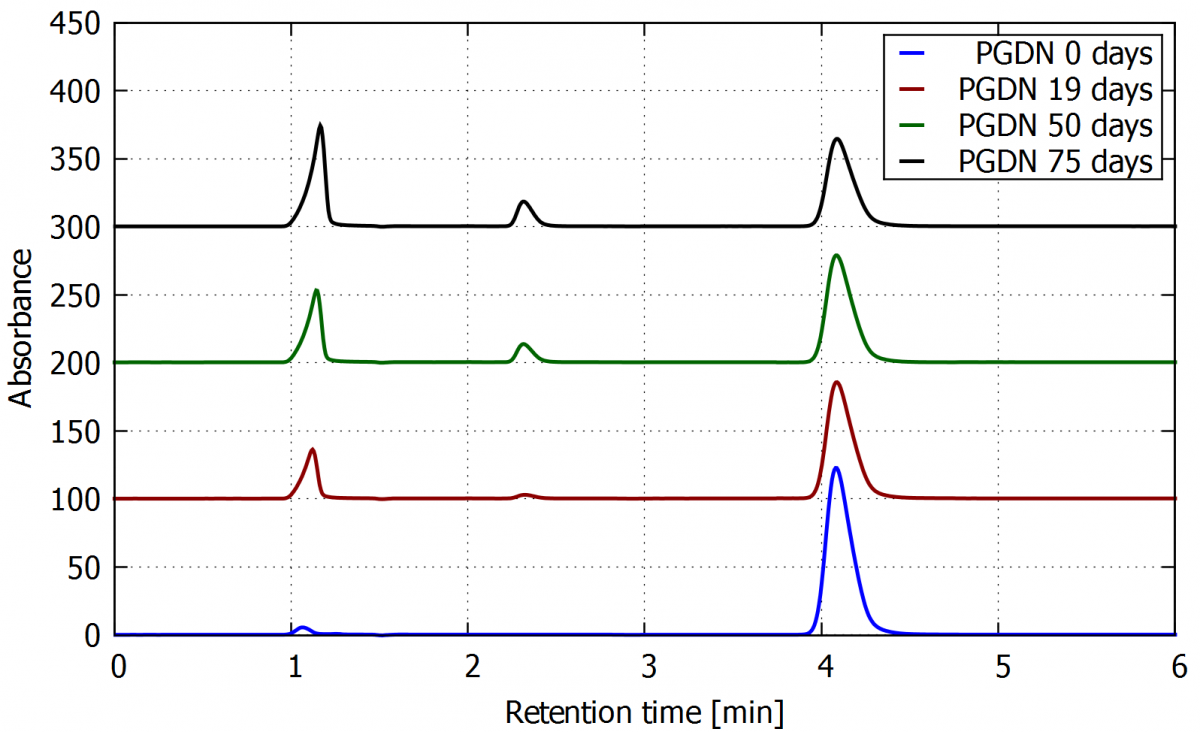
When the same data is plot in 3D, we can add the aging period as the third axis, as shown in the next figure. It is possible to rotate the graph in the gnuplot window and save it from any point of view.
|
|
| 3D graf - The aging of PGDN in 0, 19, 50 and 75 days. (script for this plot is available here) |